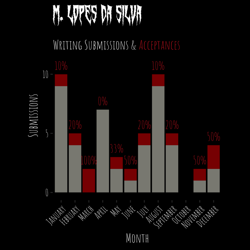
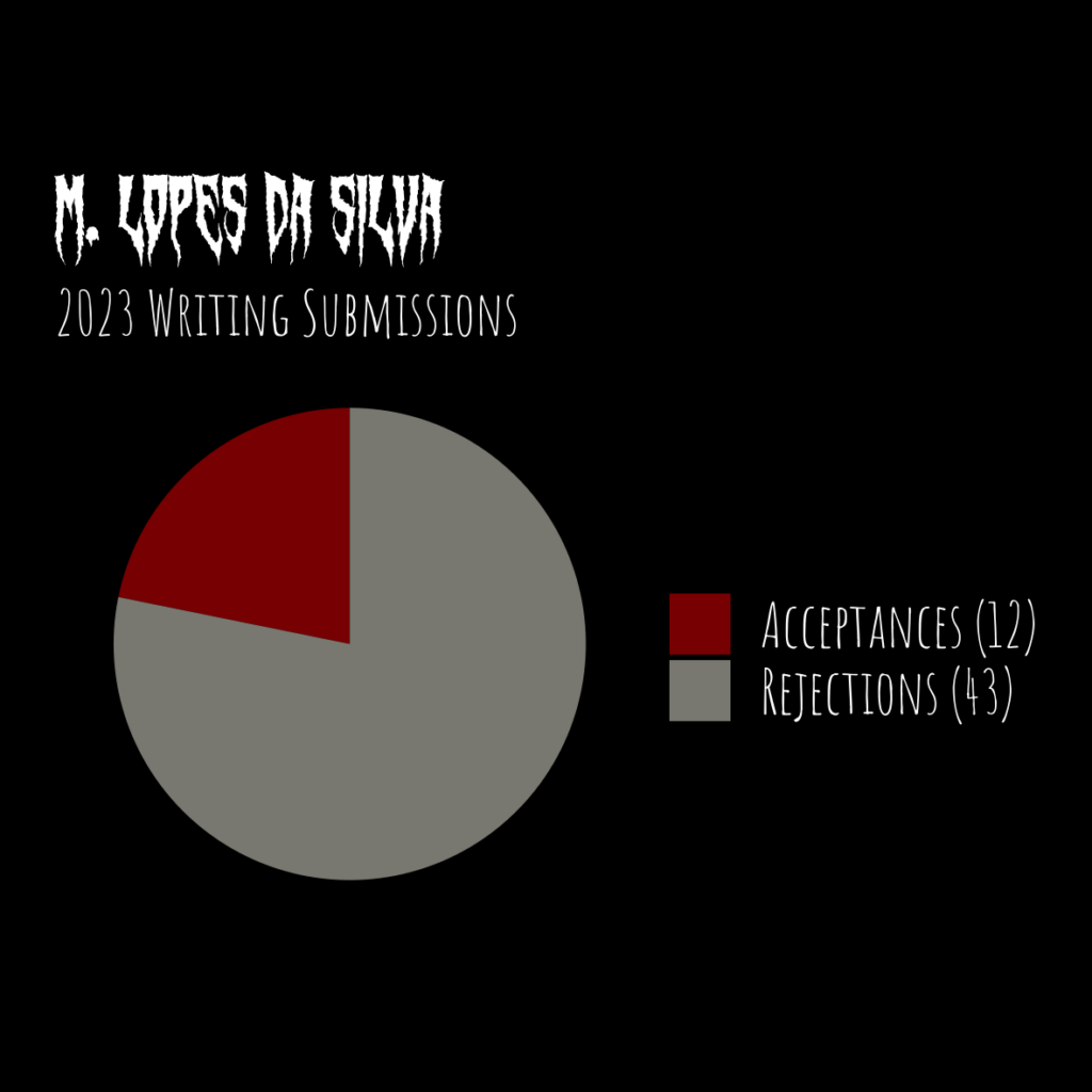
This short analysis creates data visualization for author M. Lopes da Silva’s record 2023 writing submissions and acceptances. Hooray for a full year of writing and submitting!
Basically, some of his fellow writers had posted similar graphs on social media, he asked me to make some graphs for him, and I was all too happy to do that. For this project, I used the R language with the help of some packages from the tidyverse.
First, the libraries and fonts needed.
library(magrittrlibrary(janitor)
library(dplyr)
library(tidyr)
library(ggplot2)
library(showtext)
library(kableExtra)
# Fonts
font_add_google(name = "Amatic SC", family = "amatic-sc")
font_add(family = "swamp-witch",
regular = "<path-to-fonts>/Swamp Witch.ttf")
showtext_auto()Then I loaded the data. Conveniently, M. recorded the numbers by month in a Google sheet which I downloaded as a .csv file and loaded locally.
# Read in the data
data <- read.csv("2023-subs-and-accs/data/mitch writing.csv")
Here’s what the data looks like before any transformation or summarizing.
# Show original data
data %>%
  kable %>%
  kable_styling(full_width = FALSE) %>%
scroll_box(width = "500px", height = "200px")| Month | Month.Numeral | Submissions | Acceptances |
|---|---|---|---|
| January | 23-01 | 10 | 1 |
| February | 23-02 | 5 | 1 |
| March | 23-03 | 2 | 2 |
| April | 23-04 | 7 | 0 |
| May | 23-05 | 3 | 1 |
| June | 23-06 | 2 | 1 |
| July | 23-07 | 5 | 1 |
| August | 23-08 | 10 | 1 |
| September | 23-09 | 5 | 1 |
| October | 23-10 | 0 | 0 |
| November | 23-11 | 2 | 1 |
| December | 23-12 | 4 | 2 |
I then did some simple calculation for rejections (in this case, submissions – acceptances), the proportion of acceptances (acceptances / submissions), and the percentage of acceptances (proportion * 100).
# Add calculated values to data
data <-
  clean_names(data) %>%
  mutate(submissions = as.integer(submissions),
         acceptances = as.integer(acceptances),
         rejections = submissions - acceptances,
         acceptance_proportion =
           ifelse(submissions != 0,
                  acceptances / submissions,
                  0)) %>%
  mutate(acceptance_percentage =
           paste0(as.character(round(acceptance_proportion * 100,
                                     0)),
                  "%")) %>%
  mutate(acceptance_percentage =
           ifelse(submissions == 0, "", acceptance_percentage))
Here’s what the data looks like after the cleaning.
# Show calculated data
data %>%
  kable %>%
  kable_styling(full_width = FALSE) %>%
scroll_box(width = "800px", height = "200px")| month | month_numeral | submissions | acceptances | completed | rejections | acceptance_proportion | acceptance_percentage |
|---|---|---|---|---|---|---|---|
| January | 23-01 | 10 | 1 | TRUE | 9 | 0.1000000 | 10% |
| February | 23-02 | 5 | 1 | TRUE | 4 | 0.2000000 | 20% |
| March | 23-03 | 2 | 2 | TRUE | 0 | 1.0000000 | 100% |
| April | 23-04 | 7 | 0 | TRUE | 7 | 0.0000000 | 0% |
| May | 23-05 | 3 | 1 | TRUE | 2 | 0.3333333 | 33% |
| June | 23-06 | 2 | 1 | TRUE | 1 | 0.5000000 | 50% |
| July | 23-07 | 5 | 1 | TRUE | 4 | 0.2000000 | 20% |
| August | 23-08 | 10 | 1 | TRUE | 9 | 0.1000000 | 10% |
| September | 23-09 | 5 | 1 | TRUE | 4 | 0.2000000 | 20% |
| October | 23-10 | 0 | 0 | TRUE | 0 | 0.0000000 | |
| November | 23-11 | 2 | 1 | TRUE | 1 | 0.5000000 | 50% |
| December | 23-12 | 4 | 2 | FALSE | 2 | 0.5000000 | 50% |
Bar chart of month-by-month submissions
The first chart is a stacked bar chart by month, with color coding for rejections and for acceptances.
I melted the data into long format, so that there were two rows per month. One row had rejections and one row had acceptances, with a new ‘type’ column to differentiate them. Having the data in long format made it easier to plot a stacked bar chart later.
# Create long dataframe
data_long_by_month <-
  data %>%
  pivot_longer(data,
               cols = c(rejections, acceptances),
               names_to = "type",
               values_to = "count")
Here’s what that looks like. The important part is that there are two rows per month now instead of one per month.
# Show long monthly data
data_long_by_month %>%
  kable %>%
  kable_styling(full_width = FALSE) %>%
scroll_box(width = "800px", height = "200px")| month | month_numeral | submissions | completed | acceptance_proportion | acceptance_percentage | type | count |
|---|---|---|---|---|---|---|---|
| January | 23-01 | 10 | TRUE | 0.1000000 | 10% | rejections | 9 |
| January | 23-01 | 10 | TRUE | 0.1000000 | 10% | acceptances | 1 |
| February | 23-02 | 5 | TRUE | 0.2000000 | 20% | rejections | 4 |
| February | 23-02 | 5 | TRUE | 0.2000000 | 20% | acceptances | 1 |
| March | 23-03 | 2 | TRUE | 1.0000000 | 100% | rejections | 0 |
| March | 23-03 | 2 | TRUE | 1.0000000 | 100% | acceptances | 2 |
| April | 23-04 | 7 | TRUE | 0.0000000 | 0% | rejections | 7 |
| April | 23-04 | 7 | TRUE | 0.0000000 | 0% | acceptances | 0 |
| May | 23-05 | 3 | TRUE | 0.3333333 | 33% | rejections | 2 |
| May | 23-05 | 3 | TRUE | 0.3333333 | 33% | acceptances | 1 |
| June | 23-06 | 2 | TRUE | 0.5000000 | 50% | rejections | 1 |
| June | 23-06 | 2 | TRUE | 0.5000000 | 50% | acceptances | 1 |
| July | 23-07 | 5 | TRUE | 0.2000000 | 20% | rejections | 4 |
| July | 23-07 | 5 | TRUE | 0.2000000 | 20% | acceptances | 1 |
| August | 23-08 | 10 | TRUE | 0.1000000 | 10% | rejections | 9 |
| August | 23-08 | 10 | TRUE | 0.1000000 | 10% | acceptances | 1 |
| September | 23-09 | 5 | TRUE | 0.2000000 | 20% | rejections | 4 |
| September | 23-09 | 5 | TRUE | 0.2000000 | 20% | acceptances | 1 |
| October | 23-10 | 0 | TRUE | 0.0000000 | rejections | 0 | |
| October | 23-10 | 0 | TRUE | 0.0000000 | acceptances | 0 | |
| November | 23-11 | 2 | TRUE | 0.5000000 | 50% | rejections | 1 |
| November | 23-11 | 2 | TRUE | 0.5000000 | 50% | acceptances | 1 |
| December | 23-12 | 4 | FALSE | 0.5000000 | 50% | rejections | 2 |
| December | 23-12 | 4 | FALSE | 0.5000000 | 50% | acceptances | 2 |
Then, the bar chart. In the code below, the fill by ‘type’ color-codes by rejection/acceptance, and the value position = "stack” makes this a stacked bar chart. I added prettier labels for the “Month” values, and some theming and relabeling for aesthetics.
# Make a bar chart
ggplot(data_long_by_month,
       aes(x = month_numeral,
           y = count
           fill = type,
           label = count)) +
  geom_bar(stat = "identity",
           position = "stack") +
  geom_text(aes(x = month_numeral,
                y = submissions,
                fill = NULL,
                label = acceptance_percentage,
                vjust = -0.5,
                family = "amatic-sc",
                color = "1",
                size = 8),
            data = data) +
  scale_x_discrete(labels = data$month) +
  scale_colour_manual(values=c("firebrick3")) +
  scale_y_continuous(breaks = c(0, 5, 10)) +
  coord_cartesian(ylim = c(0, 13)) +
  scale_fill_manual(values = c("darkred",
                               "ivory4")) +
  labs(title="M. Lopes da Silva",
       x = "Month",
       y = "Submissions") +
  annotate("text",
           x = 3.5,
           y = 12.5,
           label = "Writing Submissions & ",
           family = "amatic-sc",
           size = 5,
           color = "white") +
  annotate("text",
         x = 8.1,
         y = 12.5,
         label = "Acceptances",
         family = "amatic-sc",
         size = 5,
         color = "firebrick3") +
  theme_classic() +
  theme(text = element_text(family = "amatic-sc",
                            size = 14,
                            color = "white"),
        plot.title = element_text(family = "swamp-witch",
                                  size = 24,
                                  color = "white"),
        plot.subtitle = element_text(size = 16),
        axis.text.x = element_text(angle = 45,
                                   hjust = 1,
                                   color = "white"),
        axis.text.y = element_text(color = "white"),
        legend.position = "none",
        plot.background = element_rect(fill = 'black',
                                       color = 'black'),
        panel.background = element_rect(fill = 'black',
                                        color = 'black'),
        aspect.ratio=1)

ggsave("monthly_writing.png",
       width = 10,
       height = 10,
       units = "cm")
Pie chart of annual submissions
Then I made a pie chart. A lot of people will tell you that pie charts are bad. Maybe they’re right about that.
But I made one anyway. You can send me to data jail, if you must, but M. wanted a pie chart and with only two variables I think it’s pretty harmless in this case. You’re not judging differences between a lot of groups and you’re also not being asked to evaluate small differences between groups that don’t express well in a pie chart.
But check back on me in a week or two to see if I’ve been sent to data jail.
Now, before the pie chart: the data. The chart requires working at total for the full year instead of month by month, so I needed an aggregated dataset. This was easily done by summarizing with the sum of acceptances and the sum of rejections. The ‘ident’ column is just a placeholder for pivoting longer.
# Summarize data annually
data_annual <-
  data %>%
  summarize(acceptances = sum(acceptances),
            rejections = sum(rejections)) %>%
  mutate(ident = 1) %>%
  pivot_longer(cols = c(acceptances, rejections),
               names_to = "type")
# Show annual data
data_annual %>%
kable %>%
kable_styling(full_width = FALSE) %>%
scroll_box(width = "200px", height = "120px")| ident | type | value |
|---|---|---|
| 1 | acceptances | 12 |
| 1 | rejections | 43 |
And, the resulting pie chart.
Making a pie chart with ggplot2 actually uses a bar chart shape via geom_bar. This is kind of funny because usually the recommended alternative to a pie chart from people-against-pie-charts is (maybe you’ve guessed by now) a bar chart.
So, in the end we will do the big bad thing and use the bar chart code to create a pie chart. By using geom_bar and setting coord_polar we’ll get a pie chart instead of a bar chart. Again, I did just a bit of theming for aesthetic purposes, and I pre-calculated some values to add custom text.
# Calculate values for acceptances and rejections
acceptance_count =
  data_annual$value[data_annual$type=="acceptances"][1]
rejection_count =
  data_annual$value[data_annual$type=="rejections"][1]
# Make pie chart
ggplot(data_annual, aes(x = "",
y = value,
fill = type)) +
geom_bar(stat="identity",
width=1) +
labs(title="M. Lopes da Silva",
subtitle = "2023 Writing Submissions") +
coord_polar("y", start=0) +
scale_fill_manual(labels = c(paste0("Acceptances (",
acceptance_count,
")"),
paste0("Rejections (",
rejection_count,
")")),
values = c("darkred",
"ivory4")) +
theme_void() +
theme(text = element_text(family = "amatic-sc",
size = 14,
color = "white"),
plot.title = element_text(family = "swamp-witch",
size = 24,
color = "white"),
plot.subtitle = element_text(size = 16),
legend.title = element_blank(),
legend.text = element_text(size = 16),
plot.margin=grid::unit(c(5, 5, 5, 5), "mm"),
plot.background = element_rect(fill = 'black',
color = 'black'),
panel.background = element_rect(fill = 'black',
color = 'black'),
legend.background = element_rect(fill = 'black',
color = 'black'))
ggsave("annual_writing.png",
width = 10,
height = 10,
units = "cm")
Leave a Reply